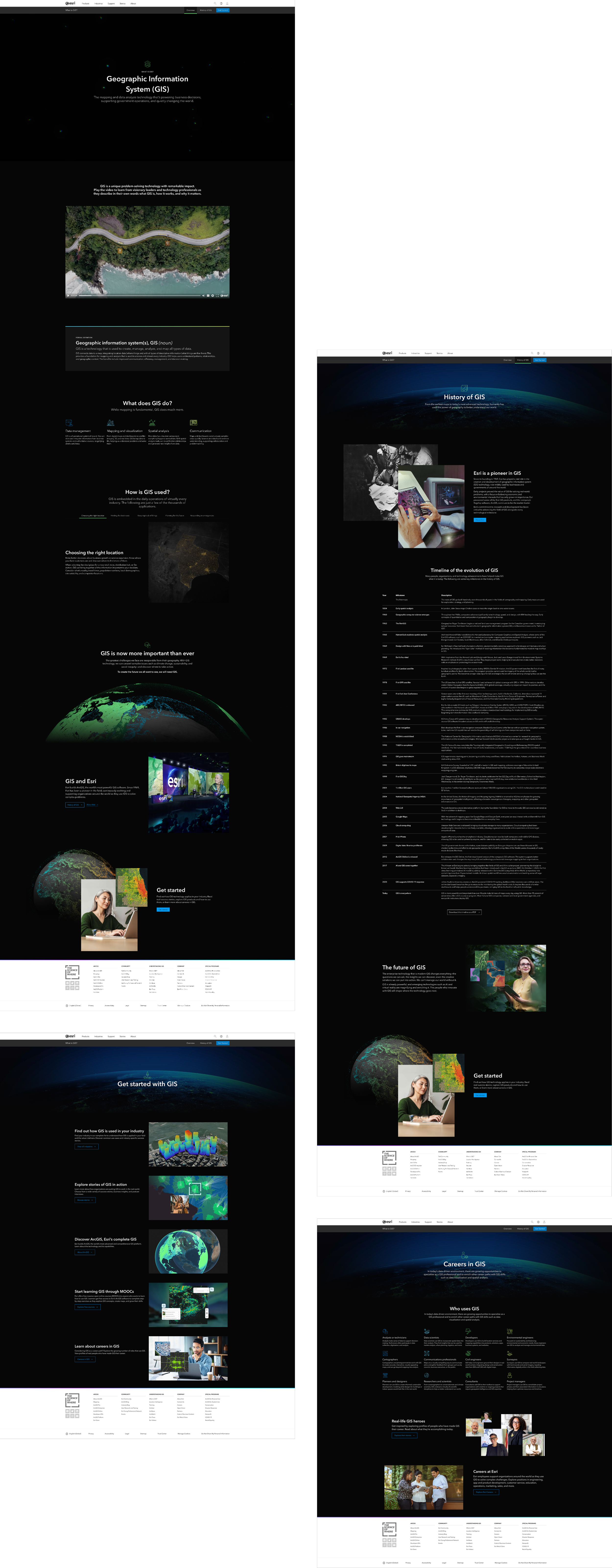
What is GIS?
Esri makes the world’s most powerful GIS software, but it had become an inside joke in the GIS community that it’s nearly impossible to explain what it is. The company's main education website, WhatIsGIS.com, had hundreds of thousands of visitors, but was packed with too much technical language and overwhelming details. It wasn't working for the people who needed it most, which are newcomers trying to understand the basics and decision-makers evaluating whether to the technology is right for them.
The solution needed to make complex ideas digestible without dumbing them down. Instead of cramming information onto dense pages, the new design gave ideas space and presented them at a cadence people could easily absorb. We created short animations that broke down key concepts using simple visuals and muted backgrounds that let the colorful data stand out as the visual hero. The approach was new for Esri, challenged how the company had traditionally explained GIS, and paved the way for a new brand narrative to form.
The results showed it worked. In the first three months, the site saw nearly double the visitors, people stayed on pages 45% longer, and far fewer left immediately after arriving. Beyond the metrics, this project helped a 50-year-old tech company find a new way to talk about its core product. It required facilitating workshops, convincing executives to try a simpler approach, and constantly steering the team back to what users actually needed rather than what felt safe or familiar.
Plus, now the internet finally has a clear answer to "What is GIS?" I love hearing from professionals in the field say they stopped trying to explain their jobs at dinner parties and just share the link instead.
Client
Esri
Role
Art Direction, Motion Design, UX/UI, Visual Storytelling
Awards
Best Branded Content Site – B2B | Digiday Content Marketing Awards
Gold Addy | American Advertising Awards
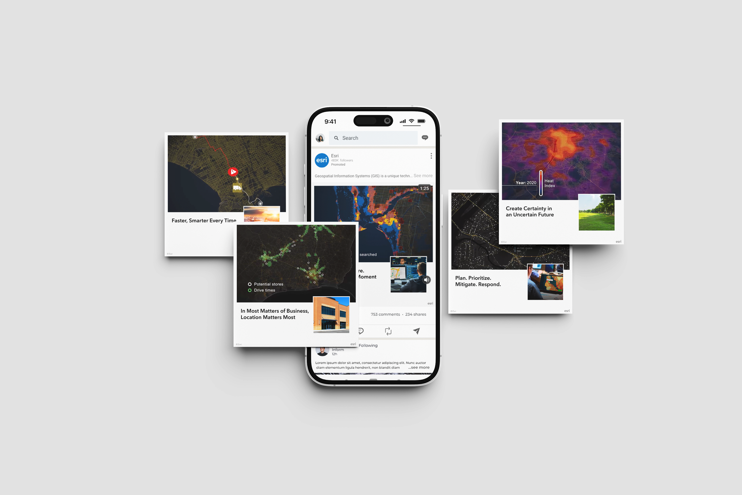
“The goal was to grow the GIS market by reaching new audiences. We inspired meaningful engagement by placing digital and print ads and articles in trusted, top-tier publications. We’re introducing people around the world to GIS through real-world stories that reveal how it’s helping solve some of the world’s biggest challenges.”

Full Credits
Art Direction: Amanda McKinley
UX UI: Amanda McKinley
Creative Direction: James Hitchcock, Carl Bender
Storyboarding: Amanda McKinley
Video Production: Peter Stonier, Will Kirkley, Travis Barton, Rachel Ortiz
Motion Graphics Production: 422 South, Dan Gill
UX Research: Adam Williams, Ali Khalid, Alex Smailes
Cartography Consultant: Nick Bauch
Copy: Andrea Massey
Front-end: Joe Savella