
Esri.com Art Direction
A design framework that meets users where they are
The Project
Client
Esri
My Role
Art Direction, UX UI
Deliverables
Design Audits, Research and Synthesis, Presentations of Findings, Artifacts Defining Visual Strategy, Concept Artwork, Pitch Decks, Style Guide, Change Adoption Materials
The Goal
Unify 5K+ web pages on Esri.com under one art direction
Esri.com serves over 2M visitors annually, catering to a diverse audience of newcomers and GIS power users. The visual design needed to visualize complex technology without overwhelming users.


Horizontal Scale
This art direction strategy scales across Esri’s entire ecosystem, from brand campaigns to product marketing to industry services to technical support.
Vertical Scale
The visual hierarchy scales up and down in complexity, serving large, bold visuals with high-level content, and more detailed visuals with technical content.


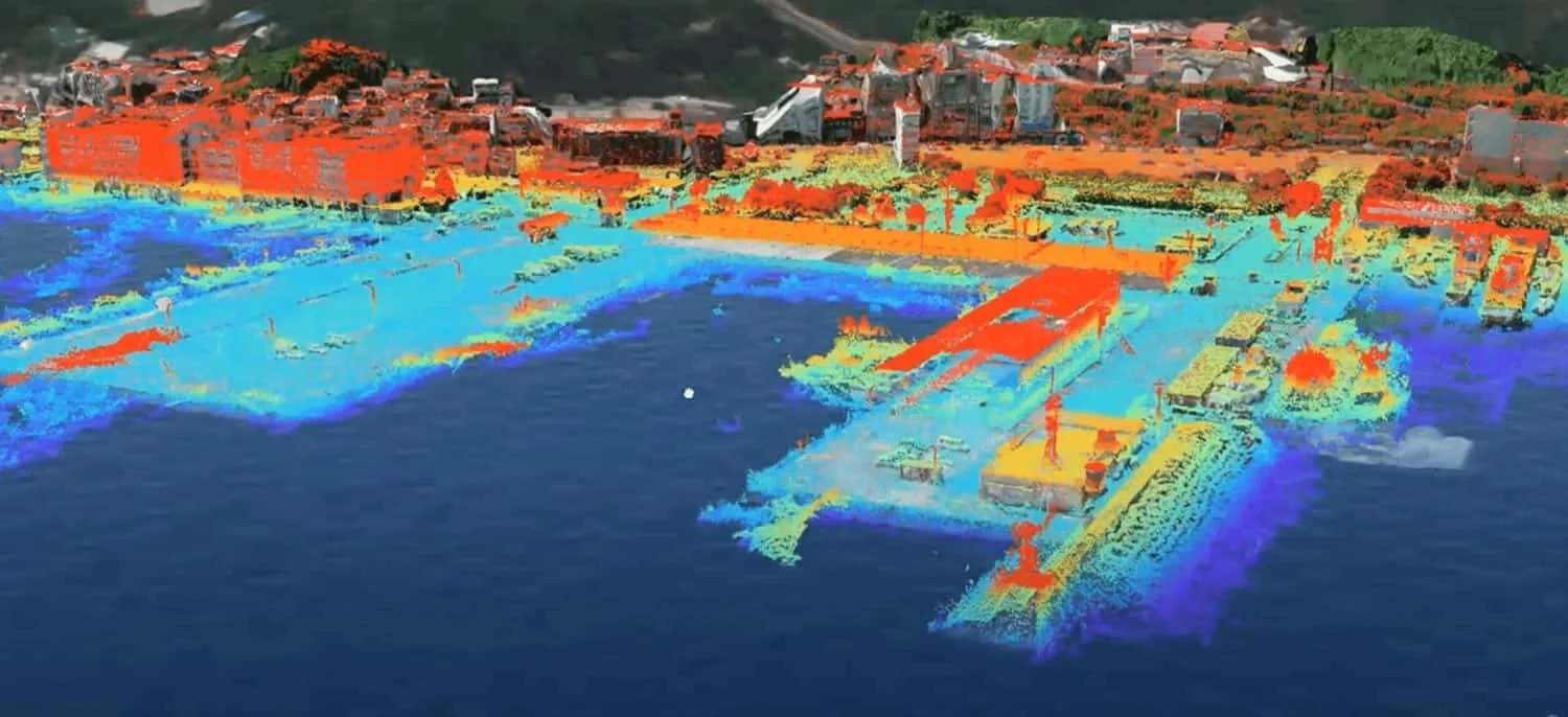
Scalable Product Visualization
Including too much technical detail risks losing a non-GIS-savvy audience by overwhelming them with information they can’t easily understand. I created this breakdown of the different types of visualization styles for different audiences.


Visual Storytelling
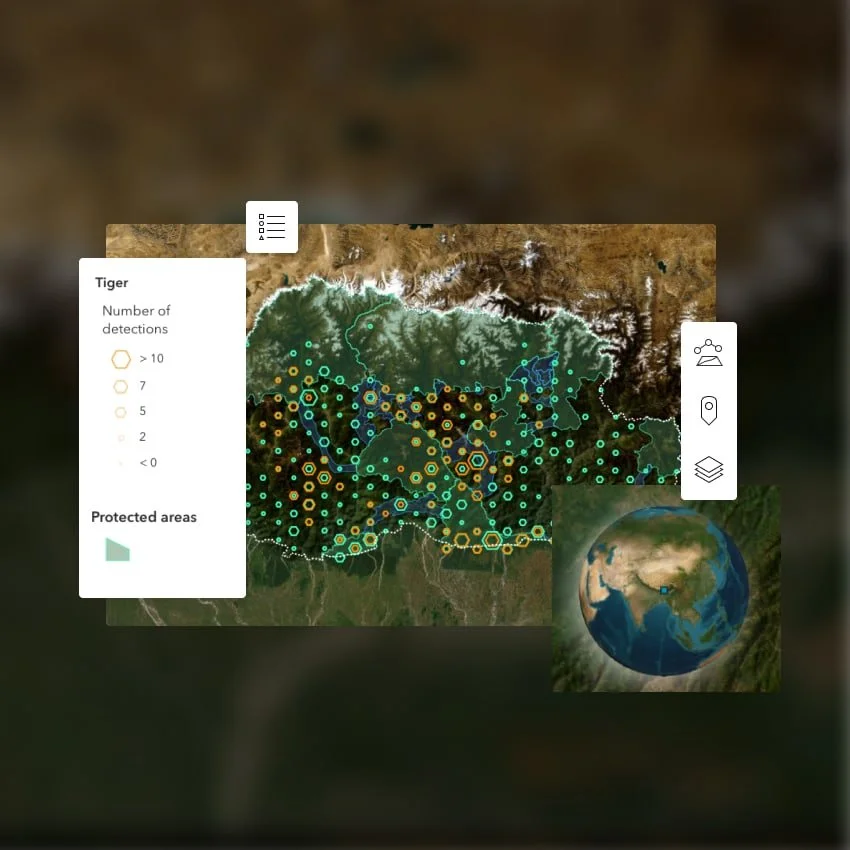
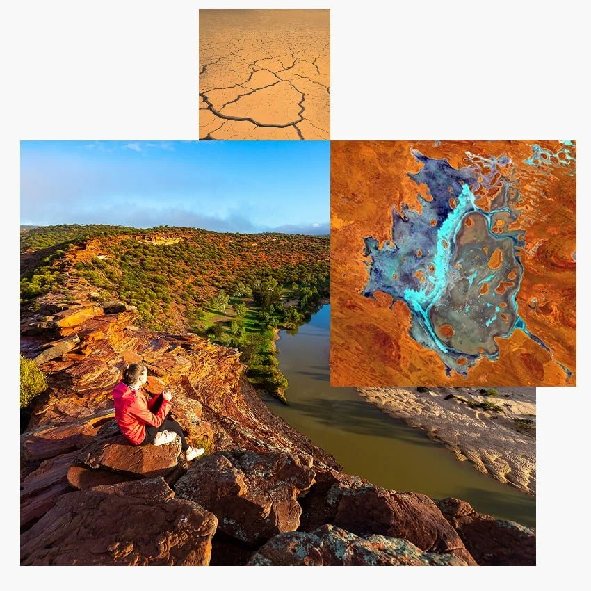
Esri’s biggest design challenge is communicating the value of GIS quickly and clearly when the technology is far from simple. By representing GIS data conceptually, we can simplify the visual message for our users. This digital overlay shows the real-world patterns and insights we learn from GIS.


Maps
More maps! Cards with maps were getting clicked much more than cards with generic stock photography, so it was important that this strategy included lots of gorgeous, compelling maps. The only thing is, they’re not that easy to create en masse, so the team hired multiple cartographic designers to support this effort.


The Style Guide
Design philosophy
Typography
Color
Maps
Photography
Branding elements
Graphic elements
Visual language
Icons and illustration
Product visualization

The work behind the work
I played a key role from initial research through final rollout—leading both the design strategy and the operational path to adoption. Here’s what I contributed over the course of a year.
-
Comprehensive audit of Esri.com to identify inconsistencies and pain points
Competitive analysis to benchmark against industry best practices
Conducted stakeholder interviews to identify opportunities from diverse perspectives
Clearly defined the problem space and surfaced areas where legacy thinking was limiting impact
Presented insights and recommendations to leadership, generating interest in a large-scale solution
-
Defined visual strategy based on audience needs across the user journey, from discovery to adoption
Created concept art that redefined our approach to visual storytelling and brand expression
Designed high-fidelity mockups to stress test scalability across use cases
Designed systems-level artifacts to demonstrate how the new strategy scales across Esri’s digital experiences
Led the creation of a style guide covering foundational elements like imagery, product visuals, and illustration
-
Proposed and implemented changes to project workflows that empowered better cross-functional collaboration
Facilitated working sessions with designers and stakeholders to iterate transparently and build alignment early
Delivered targeted presentations to executive leadership to build confidence in the new direction and secure alignment
Presentation decks and recordings available upon request
Led the organization-wide rollout of the new style guide, presenting to design, marketing, and product teams to ensure clarity and buy-in
Currently serve in an advisory role to maintain quality and consistency as adoption continues to scale across Esri.com
Content Audits
We migrated Esri.com to Adobe Experience Manager (AEM) in 2016, but there was no real centralized design system to ensure a cohesive look and feel. By 2021, much of the migration was complete, but the site’s visual design had become fragmented.
I conducted a comprehensive audit of major page types to catalog UI patterns, art direction styles, and evaluate the effectiveness of content communication across the site.
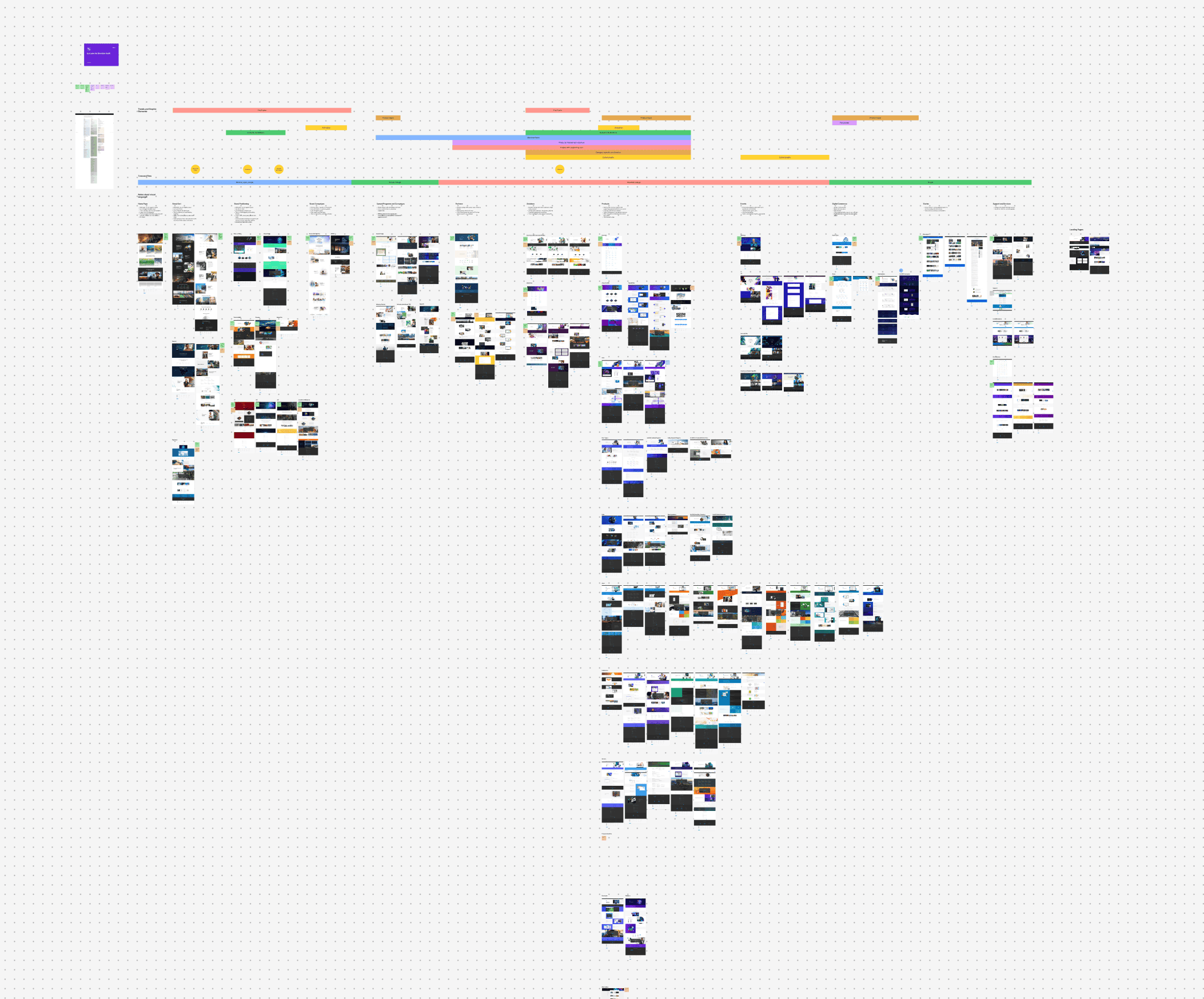
Audit of Esri.com

Major page types were visually inconsistent in the use of color, photography, and style
Stakeholder Interviews
I conducted interviews with experts across business units to gather as many perspectives as possible and to plant seeds of the change to come. It became clear that we’d need to make some big changes to the visuals we create, how we work together, and how we think about design in our organization.
“The number one problem Esri’s been trying to solve is how do we get people to understand what we do? People should visit our pages and think, ‘I didn’t know that maps are works of art that give me amazing information’.
If we can change that, just that fundamental level, I think that would be success.”
“Designers are disconnected from actually
using our software.”
“One of our challenges is that we buy into a visual direction, but then we move on from it so quickly...We deal with the symptoms of leadership being attracted to the next shiny object.”
“If we are using stock imagery and there’s a person next to a map, how is that end user going to connect the two right off the bat? Can they understand the message right away?”
Scalable Framework
I wanted our visual language to be based on the Esri.com user journey. New users discovering brand-level pages should be served more conceptual content, and current users will resonate more with technical visuals.
Design Operations
Empowering design at scale means better communication, clear roles and responsibilities. We wanted to improve how our designers were collaborating with cross-functional teams, so I created guidelines around how we work together to stay aligned, but also avoid creative by committee. We later hired a Design Ops specialist to help with this effort.

