Apollo Performance
Brand strategy and design for a new premium functional beverage
The Client
The Client
Apollo Performance
Apollo Performance
My Role
My Role
Brand Strategy Brand Identity Packaging Design
Brand Strategy Brand Identity Packaging Design
Project Team
Project Team
I worked closely with Apollo’s founder to bring his vision to life
I worked closely with Apollo’s founder to bring his vision to life


About this project
The Goal
Develop the brand identity and packaging system to bring Apollo to market
Apollo's founder had a vision for a holistic energy and recovery system for people who take their health seriously but are frustrated by complex supplement stacks and performative gym culture. He came to me with a name, an early visual direction, and a product concept that needed to become a brand capable of earning trust and competing in a crowded market.
The Problem
In a category full of claims, authenticity means credibility
The energy and recovery category is crowded and consumer trust is low. Health claims are everywhere, and people who care about what they put in their body have heard it all before. Clean energy drinks exist. Recovery supplements exist. There is no simple system designed around both, and trust in the brand mattered as much as the product itself.
The Solution
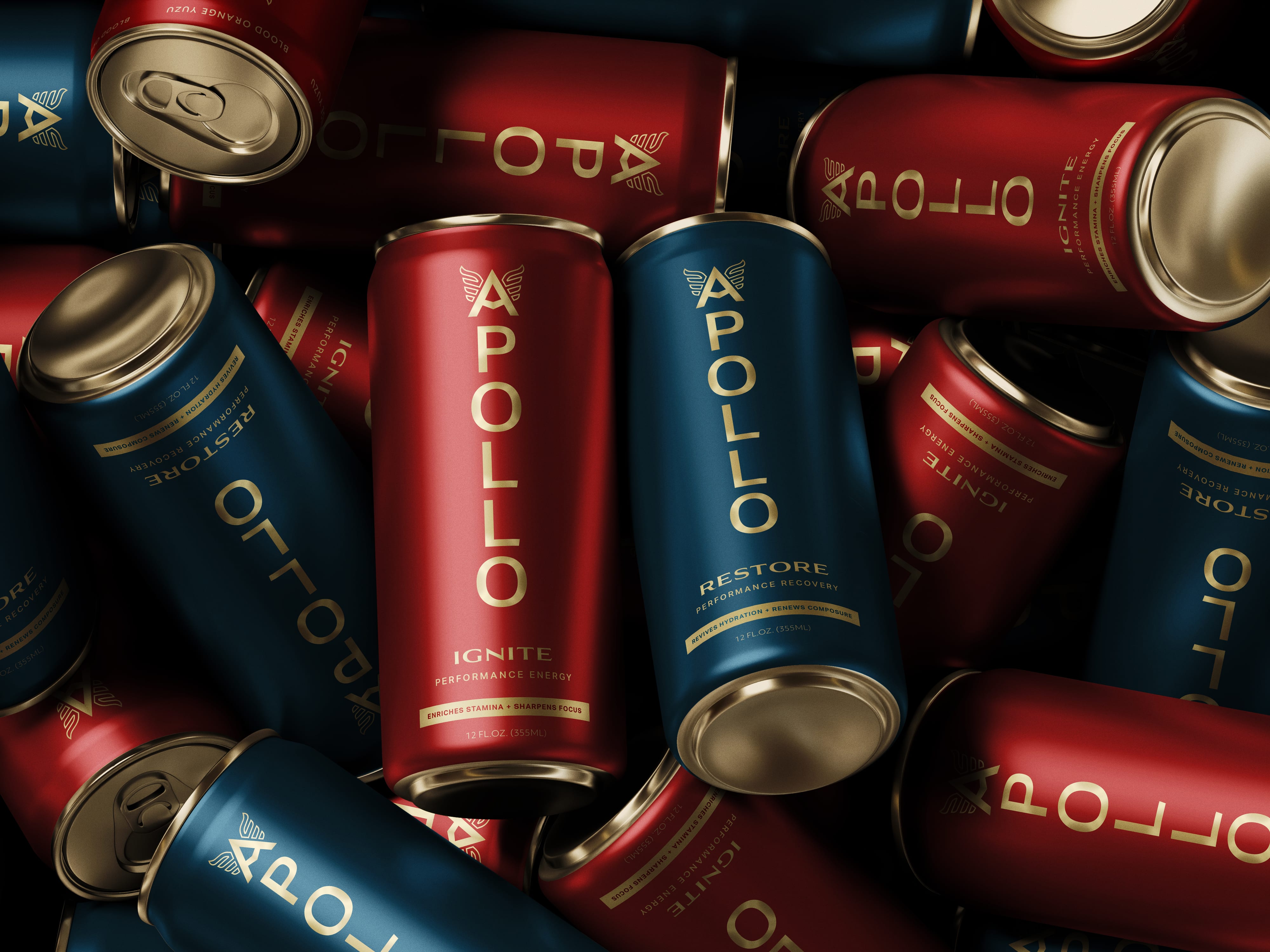
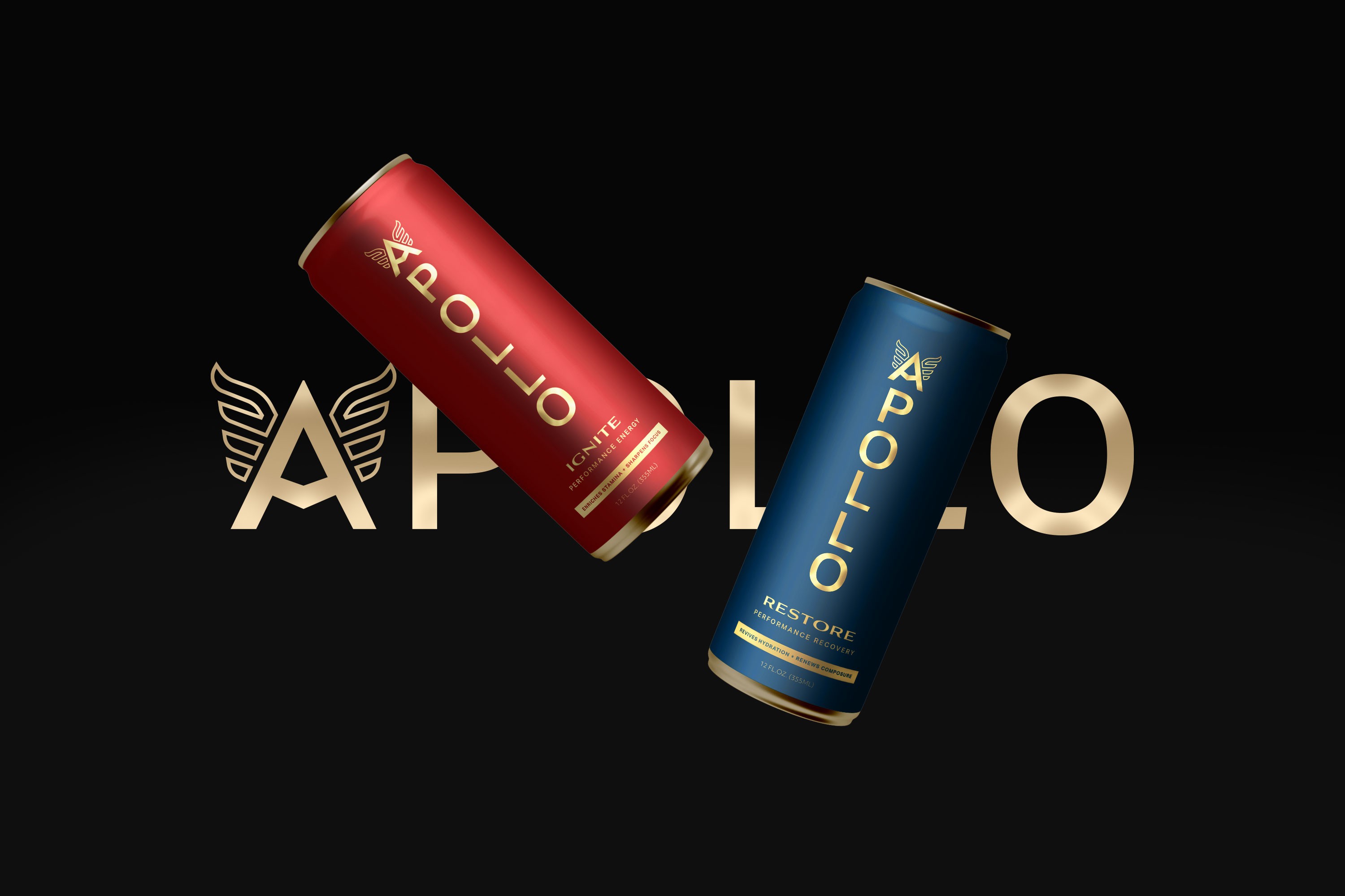
The founder's story was the reason to believe
A touring heavy metal drummer who built the product he needed but couldn't find anywhere. That story was the brand's heart, soul, and foundation of credibility. The name Apollo already carried the right weight: god of music, light, and healing, rooted in performance and renewal. The phoenix became the visual anchor. Where the category defaults to maximalist graphics, Apollo needed something restrained, premium, and grounded.
The Impact
Apollo launches in 2026.
The positioning, identity, and packaging system are already being used in investor presentations and early market testing, establishing a strategic foundation for the brand's upcoming go-to-market launch.
About this project
